A Conversation With Mong-Lan

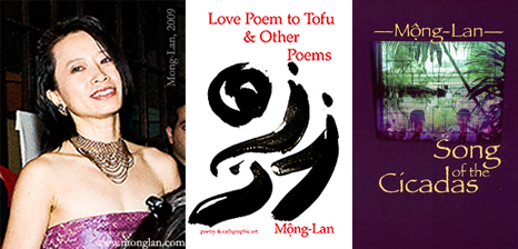
Mong-Lan and two of her book covers.

Mong-Lan is a Vietnamese-born American poet, writer, painter, photographer, and Argentine tango dancer and teacher.  Mong-Lan’s first book of poems, Song of the Cicadas, won the 2000 Juniper Prize from UMASS Press and the 2002 Great Lakes Colleges Association’s New Writers Awards for Poetry.  Her other books of poetry include Why is the Edge Always Windy?; Tango, Tangoing: Poems & Art, the bilingual Spanish / English edition, Tango, Tangueando: Poemas & Dibujos and Love Poem to Tofu and Other Poems (chapbook). A Wallace E. Stegner Fellow in poetry for two years at Stanford University and a Fulbright Fellow in Vietnam, Mong-Lan received her Master of Fine Arts from the University of Arizona.  Her poetry has been frequently anthologized, having been included in Best American Poetry, The Pushcart Book of Poetry: Best Poems from 30 Years of the Pushcart Prize; Asian American Poetry —The Next Generation, and has appeared in leading American literary journals. Her paintings and photographs have been exhibited at the Capitol House in Washington D.C.,  for six months at the Dallas Museum of Art, at the Museum of Fine Arts in Houston, in galleries in the San Francisco Bay Area, and in public exhibitions in Tokyo, Bali, Bangkok, Buenos Aires and Seoul. Based in Buenos Aires, Mong-Lan travels frequently.  Visit: www.monglan.com

LR: You are both a visual artist and a poet, and both of these art forms have a strong presence in your books.  How have your sensibilities as a visual artist have influenced your poetry’s aesthetic?  Did you come to one through the other?  At what point did the two interests begin to intersect?

ML: My sensibilities as a visual artist have influenced greatly my poetry’s aesthetic.  The open field of the page is important to me, just as the blank canvas or white sheet of paper is to the visual artist.  When writing poetry, I think in spatial terms, not just linearly.  So, in this way, I concern myself with the placement of words on the page, using the way words bounce off each other, the connotation of words next to each other, above, below, to the right and left, and diagonal. In Tango, Tangoing, my latest book, you can read certain poems not only left to right, but down one column, then down another column.

I didn’t come to one art through the other.  A visual artist since childhood, I showed my artworks in Houston and then in San Francisco, where I flowered and came to mature as a visual artist in the very liberal atmosphere there.  At the same time, I was writing since high school, scribbling in journals my feelings, emotions, narratives, stories and things that I couldn’t depict visually in paintings.

Both poetry and the visual arts are twin sisters, and it’s easy for me to shift from one to the other.  I find that these arts complement each other.  And, so, there in San Francisco in the 90’s, I found myself as a poet as well as a visual artist, giving readings with other Vietnamese-American writers/poets.

LR: When you are putting together a collection of poems that will include visual artwork — how do you view the art in relationship to the text?  Do you see the art as illustrations of your poems? As a kind of visual poetry in and of itself?

ML: In my first two books, Song of the Cicadas and Why is the Edge Always Windy?, the text is primary, and the visuals secondary.  The artwork in both books were used more as appetizers and section dividers.  In Song of the Cicadas, I included pen and ink drawings that I drew when I was in Vietnam, the same time I was writing the book itself.  It just happened, naturally and synchronistically like that.

Because many people commented on my artwork in both books, I decided to include more of them in my next books.  In the chapbook, Love Poem to Tofu & Other Poems, and in Tango, Tangoing: Poems & Art, the artworks are very integral to the books, indeed [they] complement the text a great deal, although the texts can stand by themselves.  There are many more drawings/paintings in these latter two books—they’re more like entrees and not just appetizers.

The artworks in my books can stand by themselves; thus, they are not mere illustrations. Yet, they do illuminate the text and add another dimension to it.  Yes, I would consider my artworks a kind of visual poetry in and of itself.
Continue reading “A Conversation With Mong-Lan”

Weekly Prompt: Poem-Objects

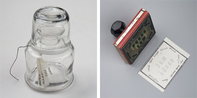
Untitled and "Mot Cache" by Theresa Hak Kyung Cha

This week’s prompt is inspired by some of the visual poetry work done by Theresa Hak Kyung Cha (1951 — 1982), a Korean American artist and poet who experimented with film, mixed media, intertext, and live performance to push her audience’s experience of the written word in radical directions.  Cha lived an incredibly productive, but tragically brief life: at the age of 31, she was murdered by a stranger in New York City.  Her much-studied book of hybrid poetry, prose, and image, Dictee, was published a week before her death.

One of the things that interests me most about Cha’s body of work is her experimentation with the book as object.  On many occasions (as in the two pieces pictured above), she made use of objects other than the standard book format in order to demonstrate a kind of poetic.  The forms and physical textures of the (often handmade) media with which she presented words in these pieces creates a process-oriented experience for the observer, in which we see and can feel the labor required to produce each piece of text.  The text itself, too, has a physical quality to it.   In the “untitled” piece above, it dangles almost precariously on wire, trapped halfway in a glass jar (the words read “water,” “fire,” “earth” . . . and something which I can’t quite make out . . . in French).  We sense the microcosmic nature of language — it becomes a flimsy, yet beautiful item that constitutes our world.

Prompt: Create a poem designed to be presented as a 3-d object.

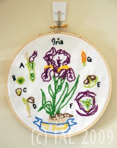
"Self-Portrait"

The piece I’m sharing with you here is actually a project I created for a contemporary poetry class last year: we were supposed to create an archaism, and I decided to use the technique of embroidery, along with nineteenth century / early twentieth century botanical diagrams and mottos from the language of flowers, to reflect on the idea of a curated representation of self (the work, obviously, is a pun on my name; the antique language of flowers handbook that I used indicated that the Iris used to convey the message “I Burn [for you]”).  This, when combined with the sexuality of the plant’s anatomical structures (a flower is a plant’s reproductive organ), and the traditionally gender-bound craft of decorative embroidery, I hope — forms a reflection on gender, artifice, craft, and time.

To see more works by Cha, visit the BAM/PFA online archive.

As always, please do feel free to share your experiments on our Flickr pool. Happy Weekend! (Don’t forget to think about an entry for our prompt contest!)

Weekly Prompt: Poems that Play with Shape

During the past week or so, we’ve been looking at poems and aspects of presenting poems on the page which take into account (2-D) visual space and make room for illustration and elements of painting, drawing, collage, etc.  This Friday, our prompt asks you to reexamine a form which many of us may remember being introduced to in grade school: the concrete poem.

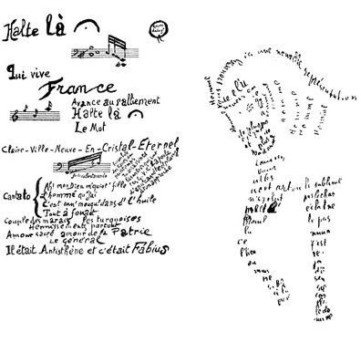
Examples of Calligrams by Guillaume Apollinaire

Concrete poetry,” according the Poetry Foundation’s glossary, is “Verse that emphasizes nonlinguistic elements in its meaning, such as a typeface that creates a visual image of the topic.”  Far from being limited to poems whose words take on the outline of the object they are describing, concrete poetry can encompass everything from a playing with the sizes and spacing of text on the page to certain kinds of full-on “visual poetry,” which are more akin to collage or painting in their methods of arrangement words. The challenge, of course, is how to integrate the visual into a poem in a way that is satisfyingly beautiful (or jarring, depending on the desired effect) and yet feels organic and further enhances the complexity of the reader’s interaction with it.

Prompt: Write a  poem takes into account shape and visual space on the flat plane of the page.

Some suggestions:

1) Compose a calligram, or poem in which the shape of the words enacts or take on the visual form of some object as a kind of complex illustration.  (See examples of Guillaume Apollinare’s famous calligrams at the top of this post).

2) Create a poem that experiments with unusual typographical arrangements to emphasize its meaning.   The Poetry Foundation also has a couple of neat visual poems that play with the shapes of letters: here, and here.

3) Write a poem on a piece of paper (or other flat surface) that is not a standard vertical letter-sized or notebook-sized sheet, using the shape of the surface to guide your form.  For example, a long piece of ribbon, or the back of a circular coaster.  I’ve found that this exercise (which I’ve borrowed from a former teacher of mine, Bruce Snider) becomes especially interesting if one uses a writing surface that already has words on it and allows those words to seamlessly flow into the resulting poem.  (Examples of poets who’ve used a similar technique include A.R. Ammons, who wrote “Sphere” on ticker tape, and D.A. Powell, who wrote one of his books with his notebook turned sideways).

4) Write a poem that engages with the use of negative space in an existing piece of text or image (for example, a poem written in the margins of a newspaper, between the lines of a letter, or in the background spaces of a photograph or advertisement).

We realize that this week’s prompt is a little different, in that your response may or may not be easy to share in comment form.  In light of this, we’ve created a Flickr pool where you can upload photos of your responses to our prompts if you’d like to share them [if you don’t feel comfortable uploading photos of whole poems, feel free to crop creatively or blur out portions of the text].  Here’s how to do it:

1) Follow this link to get to our pool.

2) Click “Join this Group.” (Sign into Yahoo/Flickr if you need to do so, or create an account).

3) Confirm that you want to “Join this Group.”

4) Upload the image or video you want to your stream.  In the description, mention the prompt you’re responding to (if you like you can include the text, too, but that’s not necessary). We suggest that you tag your poem for ease of navigation as the pool grows (for example, I’ve tagged the concrete poem I uploaded with “concrete poem”), but that’s also optional.

5) Choose “Groups >> Your Groups”

6) Select the group “Lantern Review — Weekly Prompt Responses”

7) Click “Add something.”  Follow the instructions to add your photo to the pool.  That’s it!

We hope that you’ll share some of what you’ve written with us; we’d love to see how your experiments turn out.  If we get enough responses, we may even feature some of them on the blog in upcoming weeks.

Editors’ Picks: A Roundup of Asian American Poetry Broadsides

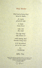
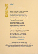
The presenting of poetry in beautifully laid-out flat prints — often accompanied with artwork or produced using the letterpress process — is a time-honored tradition.  The broadside emphasizes the way that a poem navigates visual space and draws out the reader’s sensual experience of a poem beyond the metaphorical or imagined and into the realm of physical touch, color, line, and shape.  The production of broadsides also provides opportunities for collaborative conversation between poets and the people who deal intimately with the physical production and setting of their work: book artists/printers, painters and illustrators.  In recent years (especially with the advent of internet technology), the broadside also has taken on new importance as a means by which to make poetry more familiar, more affordable, and more culturally accessible to the public.  The Poetry Foundation’s free downloadable “refrigerator” broadsides and the Broadsided project — which publishes printable electronic broadsides and encourages their free distribution in public places — are two examples of projects that seek to expand the scope of  the dialogues taking place around poetry while still maintaining a value for stunning visual presentation.  I’m particularly drawn to the idea of both kinds of broadsides — those which, by their small-scale production (often by hand), ensure that the poems printed on them will continue to be treasured as objects of quality and great cultural importance, and those which, by their widespread availability, ensure that poetry can continue to grow outside of itself, to evoke new conversations in unusual places so that the consumption of beautiful art need not be reserved for those with money.

Here is a short roundup of some broadsides I found that feature Asian American poetry:

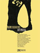
Naomi Shihab Nye – “Boy and Egg”
[One of a series of free printables from the Poetry Foundation’s web site]

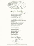
Li-Young Lee – “Every Circle Wider”
[Available from the Poetry Center of Chicago]

Jeffrey Yang – “Wolf Shadow”
[Available from the Center for Book Arts in NYC]

Agha Shahid Ali – “Ghazal”
[Available from the Center for Book Arts in NYC]

Oliver de la Paz – “If Given” and “Fury”
[Available on his web site]

Barbara Jane Reyes – “Polyglot Incantation”
[Available from Zoland Poetry]

Has your poetry ever been made into a broadside?  Do you create broadsides?  We’d love to hear from you!  Please leave a comment to tell us about your experiences.

The Page Transformed: Achiote Press’s Visual Aesthetic (Q&A with Jason Buchholz)

Last week in our series “The Page Transformed: Part II – The Page as Canvas,” we spoke to poet Craig Santos Perez about his strategic use of visual elements like typesetting and illustrations in his poetry.  In this post, we’ll be focusing on his small press, Achiote, in order to learn how decisions about developing the nuts-and-bolts aspects of a book’s visual impact — like cover art and book design — are made.

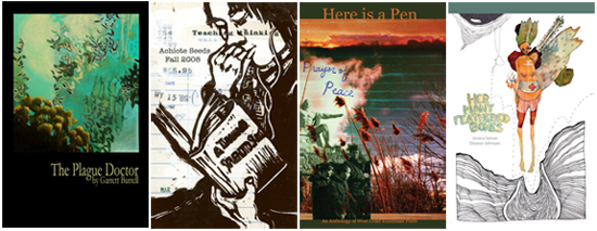
Examples of Cover Art from Achiote Press
Examples of Achiote Press Cover Art

Achiote Press, a Berkeley-based press edited by Craig Santos Perez and Jennifer Reimer, publishes poetry and art in a range of print formats, including chapbooks, perfect-bound books, anthologies, and art books.  Each season, they put out limited-run editions of two single-author chapbooks and an issue of their unique publication, Achiote Seeds, which their blog describes as a “multi-author chap-journal.” Browsing through the beautiful covers on Achiote’s web site, one gets a sense of just how thoughtfully the design of each book has been selected in order to complement the work contained within. That Achiote has a dedicated Art Director, Jason Buchholz, is even more indicative of just how important the idea of a book as a physical art object is to the press.

We  asked Jason to talk to us about Achiote’s aesthetic vision and his role as the decisionmaker behind Achiote’s “look”.  Here’s what he had to say about his process:

“I allow our overall aesthetic to emerge from the works themselves. I read each manuscript carefully, in search of two things: recurring visual imagery, and a distilled sense of the overall emotionality of the work. In other words, I try to experience a manuscript as if it were a visual work, translating movement, change, and the other temporal qualities of writing into a single impression. I then look for an image that will match that impression, as well as the title.  The role of the title here can’t be understated – it’s the interplay of image and title that not only gives the book its initial impact,
but also creates an inescapable psychological context for reading the words inside. My primary goal with each cover is to ensure that this context remains true to the writer’s intentions. If I’m working on an anthology, I’ll try to match the unifying theme, rather than specific images or feelings. In those rare cases that we publish collections without strong themes, I simply use the opportunity to showcase a great piece of work I want the world (or at least our readership) to
see. Our overall aesthetic, then, is the sum total of all these book covers, plus my personal contributions of a simple logo and a dash of orange.

In the future I hope to produce more works that place art and writing on equal footing.  Just this week we released Her Many Feathered Bones, which sees an artist and a poet on equal footing, in a slow and deliberate dialogue in which neither art form is given precedence. To me this represents the beginning of a new aesthetic that emerges almost entirely from our artists and their work. In such cases, I will have very few decisions to make. My role will be that of front-row observer, part-time quality assurer, and occasional matchmaker.”

Thanks very much to Jason for taking the time to offer his thoughts to us, and to Craig Perez for passing our questions on to him. Please do take the time to visit Achiote’s web site and browse through the covers from their current list and archives — they are truly gorgeous, and are testament to the love, taste, and meticulous attention that goes into each of Jason’s design choices.

Jason Buchholz is an artist, writer, and editor living in El Cerrito, CA. Someday his work will be available at jasonbuchholz.com.

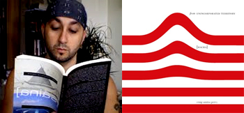
The Page Transformed: A Conversation with Craig Santos Perez

Craig Santos Perez with his second book, and the cover of his first.

CRAIG SANTOS PEREZ, a native Chamoru from the Pacific Island of Guahån (Guam), is the co-founder of Achiote Press (www.achiotepress.com) and author of two poetry books: from unincorporated territory [hacha] (Tinfish Press, 2008) and from unincorporated territory [saina] (Omnidawn Publishing, 2010). He received an MFA from the University of San Francisco and is currently a Ph.D. candidate in Comparative Ethnic Studies at the University of California, Berkeley. He blogs at craigsantosperez.wordpress.com.

* * *

In keeping with our investigation of “The Page As Canvas,” we recently sought the opportunity to speak with Mr. Perez about his strategic use of typography, visual arrangement of words, and maps in his first book, from unincorporated territory [hacha]Ever gracious, he offered us the insights that follow.

LR: How did the idea for the project that is from unincorporated territory come about?

CP: My multi-book project, from unincorporated territory, formed through my study of the “long poem”: Pound’s Cantos, Williams’ Paterson, H.D.’s Trilogy, Zukofsky’s “A,” and Olson’s Maximus. I loved how these books were able to attain a breadth and depth of vision and voice. So I began to imagine each book from my own project as a book-length excerpt of a larger project. One difference between my project and other “long poems” is that my long poem will always contain the “from,” always eluding the closure of completion.

I also became intrigued by how certain poets write trans-book poems: such as Duncan’s “Passages” and Mackey’s “Songs of the Andoumboulou.” I employ this kind of trans-book threading in my own work as poems change and continue across books (for example, excerpts from the poems “from tidelands” and “from aerial roots” appear in both my first and second books). These threaded poems differ from Duncan and Mackey’s work because I resist the linearity of numbering that their work employs.

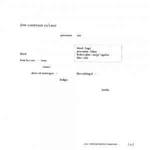
from LISIENSAN GA'LAGO p. 77
Typographic "mapping" in the poem "from Lisiensan Ga'lago" (Click to Enlarge)

LR: Your first book, from unincorporated territory [hacha], is unique in that it makes use of strategic typography, diagrams, maps, illustrations, and other aspects of its visual design to put forth both its politics and its poetics. What was your process like in developing this visual vocabulary and drafting your writing into its framework?

CP: I imagine the blank page as an excerpted ocean filled with vast currents, islands of voices, and profound depths. I imagine the poem forming as a map of this excerpted ocean, tracing the topographies of story, memory, genealogy, and culture. So creating the visual vocabulary of my work is a process of both drafting these word maps and navigating their currents.

I use diagrams, maps, and illustrations as a way to foreground the relationship between storytelling, mapping, and navigation. Just as maps have used illustrations (sometimes visual, sometimes typographical), I believe poetry can both enhance and disrupt our visual literacy.

One incessant typographical presence throughout my work is the tilde (~). Besides resembling an ocean current and containing the word “tide” in its body, the tilde has many intriguing uses. In languages, the tilde is used to indicate a change of pronunciation. As you know, I use many different kinds of discourse in my work (historical, political, personal, etc) and the tilde is meant to indicate a shift in the discursive poetic frame. In mathematics, the tilde is used to show equivalence (i.e. x~y). Throughout my work, I want to show that personal or familial narratives have an equivalent importance to official historical and political discourses.

LR: Can you talk specifically about the importance of maps and mapping (topological, geographic, typographic) within the text?  How would you describe the role of the actual maps (of flight plans, military bases, etc.) contained within the text with respect to the greater arc of the work? Do you see them as a genre of visual poem in and of themselves, or as illustrations to the text that surround them?

CP: Cartographic representations of the Pacific Ocean developed in Europe at the end of the 15th century, when the Americas were incorporated into maps: the Pacific became a wide empty space separating Asia and America. In European world maps, Europe is placed at the center and “Oceania” is divided into two opposite halves on the margins. As imperialism progressed, every new voyage incorporated new data into new maps.

As I mention in the preface to my first book, the invisibility of Guam on many maps—whether actual maps or the maps of history—has always haunted me, especially after I migrated with my family to the States in 1995. One hope for my poetry is to enact an emerging map of “Guam”—both as a place and as a signifier—into what Albert Wendt calls “new maps, new fusions and interweavings.”

The “actual maps” in my first book are, to me, both visual poems and illustrations of the rest of the work (they were created by designer Sumet (Ben) Viwatmanitsakul, based on maps that I included in my original manuscript). In my imagination, they function in two ways: first, they center “Guam,” a locating signifier often omitted from many maps. Secondly, the maps are meant to provide a counterpoint to the actual stories that are told throughout the book. While maps can locate, chart, and represent (and through this representation tell an abstracted story), they never show us the human voices of a place. I place this abstract, aerial view of “Guam” alongside the more embodied and rooted portraits of place and people (like in the poem “ta(la)ya,” which stories about my grandfather’s experience on Guam during World War II).

LR: Your second book, from unincorporated territory [saina], was recently published by Omnidawn. How was the process for the second book similar to, and different from, your process for the first?

from UNINCORPORATED TERRITORY [SAINA]
Perez's second book
CP: My second book continues the themes of culture, language, memory, family, and history that were launched in my first book. Like the first book, the second book explores various modes of storytelling, mapping, and navigation. I wrote my first book between 2004-2006, and my second book between 2006-2009. I hope that my craft has improved, sharpened, and expanded.
[Saina] more directly explores the themes of militarization and tourism. There’s also a 10-part poem that directly addresses navigation; more specifically, the poem contours the current cultural reclamation project of traditional canoe-building and navigational practices on Guam. [Saina] also contains my most ambitious poem to date, a 50-page work titled “from organic acts,” which stories my grandmother’s experience as a child during the war, her migration to the United States, and her aging in relation to the themes of religion and citizenship.

LR: What’s next on the horizon for you?

CP: I’ll be traveling for the second book in the next two months: New York this week, Guam after that, then Denver, Seattle, Portland, and Hawaii, with a few readings in the California Bay Area. In the fall, I’ll do an East Coast tour…and possibly make my way to Great Lake states. In terms of poetry, I am in the beginnings of the third book length excerpt of from unincorporated territory.

LR: Do you have any words of advice for younger poets?

CP: Keep reading, keep writing, keep submitting. One thing that helped me tremendously as a young poet is book reviewing. I couldn’t afford to buy contemporary poetry books, so reviewing allowed me to receive free books. Additionally, engaging with texts sharpened my critical / poetic thinking, which inevitably rubbed off on my creative work. Also, it’s a good way to build up your publication credits and to contribute to the critical discourse.

* * *

Thanks very much to Craig Perez for sharing his thoughts with us.  Look out for a post on Achiote Press’s visual aesthetic next week.

The Page Transformed: Part II – The Page as Canvas

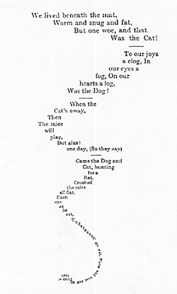
Lewis Carroll's "The Mouse's Tale"

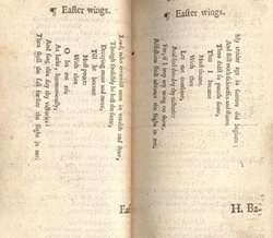
In this second installment of our March 2010 theme, “The Page Transformed: Intersections of Poetry & the Visual Arts,” we’ll be thinking about poetry which makes use of the visual elements of its form to create and enhance meaning.  Although the term “concrete poetry” was not coined until the 1950’s, poets were using elements of design and typography long before then. George Herbert’s shaped poems (like “Easter Wings”) and Lewis Carroll’s “A Mouse’s Tail” are two particularly classic examples, while a more contemporary example might be the typographical experiments of e.e. cummings (as in his poem “r-p-o-p-h-e-s-s-a-g-r“).  Thinking of the page as a space by which to convey both verbal and visual meaning paved the way for surrealist experiments with exercises like cut-up technique, which employs elements of collage to create new poems by disassembling and rearranging existing words on the page (The Academy of American Poets’ Website has an interesting article on Futurism, Dada, and Concrete Poetry).  Today, visual poetry is now a field unto itself (The Poetry Foundation has a wonderful article about the subject if you’re interested in exploring more).

George Herbert's "Easter Wings"

As we think about The Page as Canvas, we’ll be looking not only at writers who employ strategic visual elements to put forth their poetics,  but also at the importance of elements like book design, cover art, illustration, and print formats like broadsides, which really do turn text into pieces of visual art.  As we move forward into the technical elements of producing the physical page, our explorations will turn us towards the third phase of our series, in which we’ll  examine The Book as Object.

Editors’ Picks: Ekphrastic Poetry Resources

As we wrap up the first part of our March theme, we’d like to offer you the following list of resources, which we hope will inspire you to delve deeper into the world of ekphrastic poetry.

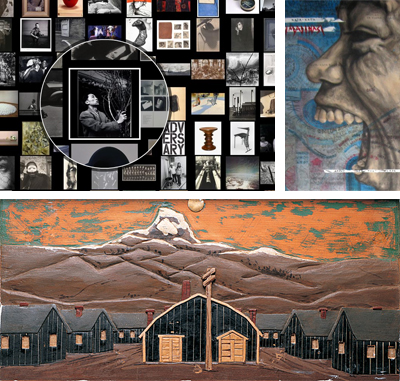
Clockwise from Top L: ArtScope Screenshot, Detail of I Gusti Putu Hardana Putra's "Unvoice" (Carrying Across Exhibit), "Camp Scene" (Art of Gaman Exhibit)

Asian American Art: Gallery Exhibits

The Art of Gaman – Arts and Crafts from the Japanese American Internment Camps, 1942-1946
Smithsonian American Art Museum | Renwick Gallery (Washington, D.C.)
March 5, 2010 — January 30, 2011

Carrying Across (curated by Yvonne Lung)
[Multimedia exhibition exploring acts of interpretation and translation]
Asian Arts Intiative (Philadelphia)
Feburayr 19, 2010 — April 30, 2010

Paj Ntaub: Stories of Hmong in Washington
Wing Luke Asian Museum (Seattle)
March 5, 2010 — October 17, 2010

Here and Now: Chapter III — Towards Transculturalism (Chinese Artists in NY)
Museum of Chinese in America (New York City)
February 11, 2010 — March 28, 2010

Poetry in the Galleries

de Young Poetry Series
Part of the”Cultural Encounters: Friday Nights at the de Young” program hosted by the San Francisco’s de Young Museum.  This month, the series is being hosted by Michael Ondaatje and will take place on March 19th. (See our Community Calendar for more details).

Claim the Block: A WritersCorps Reading Series
Student artists from the WritersCorps San Francisco program present their work at a number of gallery venues around the city.  March’s installment will take place at the Contemporary Jewish Museum.

Online Image Archives & Tools

New York Public Library Digital Gallery
A truly useful collection of over 700,000 archival images — you’ll find book illustrations, art prints, photographs, postcards, images from magazines and newspapers, and more.  We did a simple search for “chinatown” and came up with 256 really interesting hits.

SFMOMA ArtScope
If you look at nothing else in this post, you must check out this super-cool art browsing tool.  The SF Museum of Modern Art has made it possible for you to dynamically explore 4,775 individual images from their collection simply by zooming, dragging, and clicking.  Browsing through the wall of images as it expands and contracts in response to your mouse-clicks is a completely mesmerizing experience, not to mention a great free way to familiarize yourself with the museum’s collection.  Adobe Flash Player is required to view the site.

Magazines

poet’sPicturebook
Curated by Marne Kilates, this online journal focuses on ekphrastic poetry, presenting poems artfully alongside the images which inspired them.  Of note: the most recent issue includes work by Luisa Igloria, whose thoughts on ekphrasis were featured in a recent post of ours.

Ekphrasis
Ekphrasis
, says its web site, “is a poetry journal looking for well-crafted poems, the main content of which addresses individual works from any artistic genre . . . Acceptable ekphrastic verse transcends mere description: it stands as transformative critical statement, an original gloss on the individual art piece it addresses.”  Ekphrasis is available by subscription.  Submissions are accepted via postal mail.

The Page Transformed: Fiona Sze-Lorrain on Ekphrasis

Man Ray's "Larmes"
Man Ray's "Larmes"

As we continue our exploration of ekphrastic poetry, poet Fiona Sze-Lorrain, whose first book (Water the Moon) we reviewed last month, graciously answers some questions that we’ve posed to her about the ekphrastic elements of her collection.

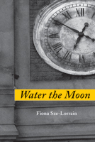
WATER THE MOON

LR: How do you envision your work with ekphrasis with respect to the larger arc or project of Water the Moon?

FSL: Ekphrasis is indeed one of the many channels I turn to for building the muscle of my imagination. The Greeks say, “In the beginning was the verb.” How about “In the beginning was the image”? I remember having read — a long time ago — an interview with the French theatre artist, Ariane Mnouchkine, who (probably influenced by the Japanese theatre philosopher and pioneer, Zeami) perceived emotion as coming from recognition, which is an useful perspective for actors. In a way or another, I too define my experience of ekphrasis as emotion coming from recognition… for instance, by recognizing something in paintings that can transform descriptive clues to deceptively personal/emotional landscapes or narrative possibilities. Part of the larger arc of Water the Moon is about dialogues with artistic voices or consciousness that follow me like shadows over time. Steichen, Van Gogh, Dora Maar, Man Ray… these happen to be just some of them whose iconic images play a role in molding my sensibilities since a child.

LR: In “Steichen’s Photographs,” you write “Photos have no verbs . . . / . . .Verbs are those trying not to pose” (58). Indeed, it seems that your ekphrastic engagement with photography in the collection is more immediate in nature than your engagement with other artistic media, like painting — for example, in “Van Gogh is Smiling,” you continually invite a reconstruction of his iconic images, “Let’s imagine fifteen sunflowers” or “Let’s retrace your starry blue night” (51), rather than delivering a direct experiential response to a particular work. In what ways does the camera’s eye provide a different type of visual or interpretive experience than other forms of visual art (e.g. painting, sculpture)?  How did these differences influence your decisions about craft and perspective?

FSL: Perhaps this is just a personal preference. I am married to a man who knows much about the world and craft of photography. By chance and good fortune, I have also crossed paths with the work of a few important photographers of our times. So I tend to feel more intimate with photographs, though paintings, to be honest, always offer me the contemplative space whenever I need it. Photographs — less so. They tend to be more visceral for me, and contain specific social realities that I can more easily identify with or pinpoint. As you can see, the cover image of my new book of poetry, Water the Moon (italics) is also a photograph. (It is entitled “Cortona,” taken by American photographer, Blake Dieter, in Italy). The clock in it is a metaphor of the Moon – in terms of time. I like films tremendously too and sometimes imagine photographs as immortalised snapshots from an unknown film. In general, it is harder for me to be oblique when writing about photographs than about paintings. You do not see something just because it is visible. There must be something else. What is it? I don’t know.

LR: Both “Steichen’s Photographs” and “Larmes” balance deftly on the seam between the perceived and the perceiver — in other words, we are made aware of the strange subjectivities at work when our gaze as readers is directed towards the speaker, whose observations become the subject of the poem as a piece of art, even while she herself is engaged in a process of fixing another artist’s subject in her own gaze. How can ekphrasis be of use to both the poet and the reader of poetry as an exercise in gaze, perspective, and subjectivity?

FSL: Ekphrasis (like any form of writing) is all about distance, because ultimately even if emotion must come from recognition, there comes a distilled point when the lie of the expression becomes evident: the artist, the painting, the poem, the writer, the reader, the reading … all these can never exist in one same space of subjectivity. “Let it not be the medium we question but the man — painter and photographer,” summed up Sadakichi Hartmann in “A Monologue” that was published in Camera Work in 1904, around the time of Steichen’s early photography. If anything, what ekphrasis offers is a bridge between various agendas, intentions and temporalities, based on an unchanging image. This bridge is dynamic — it constructs and deconstructs itself all the time. Besides, no one gaze is identical. I suppose it really is just simply the evocative power of an image that defines what we would call ekphrasis. At least this is what I feel – for now…

To read more about Fiona Sze-Lorrain, please visit her web site.   Water the Moon was released by Marick Press in February 2010 and is available for purchase on their site.

Weekly Prompt: Ekphrastic Poetry

Torso of ApolloEdvard Munch’s “The ScreamGrecian Urn

In keeping with our theme for the month, The Page Transformed, this week we’ll be looking at the ekphrastic poem, or poetry written in conversation with a work(s) of visual art.  In its most traditional form, the ekphrastic poem is an elaborate, highly detailed description of a work of art: a painting, a statue, even a drawing or photograph.  In contemporary poetry, however, the ekphrastic mode has evolved to include a wide range of forms and responses to visual art.  The poet can respond to the artwork, challenge its claims, inhabit it in the lyrical mode, or even use it as a point of departure into a larger discussion or narrative.

Alternatively, ekphrasis can also be an invitation to reflect upon the moment of encounter between the poet and painting (for example), or the circumstances under which the work of art was created.  Some of the most successful poems of ekphrasis are contemplations on the materials from which specific visual masterpieces were created.  Others adopt a mode of “re-framing” the painting, and narrate a particular scene from the perspective of someone situated outside of the painting, or someone shadowed in the periphery of the image.

Virtually any of these forms of engagement (and many others, not listed here!) can afford the poet a powerful way to further explore the rich intersections between language and visual art.

*   *   *

Prompt: write a poem that engages a work of art in one of the modes discussed above.  You can either begin with a selected work of visual art and let your poem unfold from there, or begin with a line (or image) of poetry and work “backwards,” searching for a work of art that captures the mood or sensibility you want to evoke.

However you choose to approach this, allow your creative process to be dialogic, to move in conversation between image and text, and to afford both the room to be works of art that can stand on their own.

For further reading and some wonderful examples of ekphrastic poems, take a look at the Academy of American Poets’ article “Ekphrasis: Poetry Confronting Art.”  Among the poems listed in the article are:

Stealing The Scream by Monica Youn

Archaic Torso of Apollo” by Rainer Maria Rilke

Ode on a Grecian Urn” by John Keats

Good luck, and happy writing!  As always, please consider sharing any responses to this prompt with the Lantern Review community by posting here.